A palette of Color constants that describe colors commonly used when matching the iOS platform aesthetics.
Color palettes
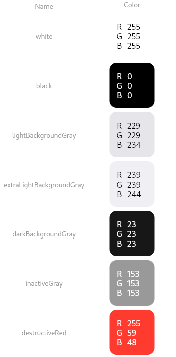
Basic Colors
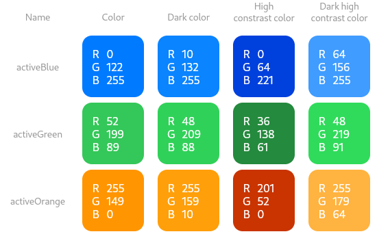
Active Colors
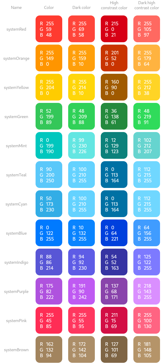
System Colors
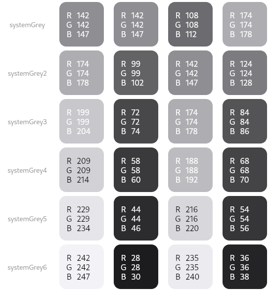
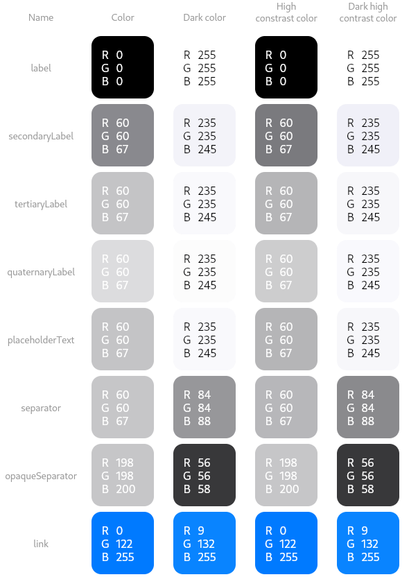
Label Colors
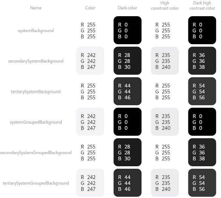
Background Colors
Properties
- hashCode → int
-
The hash code for this object.
no setterinherited
- runtimeType → Type
-
A representation of the runtime type of the object.
no setterinherited
Methods
-
noSuchMethod(
Invocation invocation) → dynamic -
Invoked when a nonexistent method or property is accessed.
inherited
-
toString(
) → String -
A string representation of this object.
inherited
Operators
-
operator ==(
Object other) → bool -
The equality operator.
inherited
Constants
- activeBlue → const CupertinoDynamicColor
- iOS 13's default blue color. Used to indicate active elements such as buttons, selected tabs and your own chat bubbles.
- activeGreen → const CupertinoDynamicColor
- iOS 13's default green color. Used to indicate active accents such as the switch in its on state and some accent buttons such as the call button and Apple Map's 'Go' button.
- activeOrange → const CupertinoDynamicColor
- iOS 13's orange color.
- black → const Color
- Opaque black color. Used for texts against light backgrounds.
- darkBackgroundGray → const Color
- Used in iOS 12 for very dark background fills in tables between cell groups in dark mode.
- destructiveRed → const CupertinoDynamicColor
- Used for iOS 13 for destructive actions such as the delete actions in table view cells and dialogs.
- extraLightBackgroundGray → const Color
- Used in iOS 12 for very light background fills in tables between cell groups.
- inactiveGray → const CupertinoDynamicColor
- Used in iOS 13 for unselected selectables such as tab bar items in their inactive state or de-emphasized subtitles and details text.
- label → const CupertinoDynamicColor
- The color for text labels containing primary content, equivalent to UIColor.label.
- lightBackgroundGray → const Color
- Used in iOS 10 for light background fills such as the chat bubble background.
- link → const CupertinoDynamicColor
- The color for links, equivalent to UIColor.link.
- opaqueSeparator → const CupertinoDynamicColor
- The color for borders or divider lines that hide any underlying content, equivalent to UIColor.opaqueSeparator.
- placeholderText → const CupertinoDynamicColor
- The color for placeholder text in controls or text views, equivalent to UIColor.placeholderText.
- quaternaryLabel → const CupertinoDynamicColor
- The color for text labels containing quaternary content, equivalent to UIColor.quaternaryLabel.
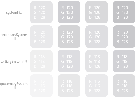
- quaternarySystemFill → const CupertinoDynamicColor
- An overlay fill color for large areas containing complex content, equivalent to UIColor.quaternarySystemFill.
- secondaryLabel → const CupertinoDynamicColor
- The color for text labels containing secondary content, equivalent to UIColor.secondaryLabel.
- secondarySystemBackground → const CupertinoDynamicColor
- The color for content layered on top of the main background, equivalent to UIColor.secondarySystemBackground.
- secondarySystemFill → const CupertinoDynamicColor
- An overlay fill color for medium-size shapes, equivalent to UIColor.secondarySystemFill.
- secondarySystemGroupedBackground → const CupertinoDynamicColor
- The color for content layered on top of the main background of your grouped interface, equivalent to UIColor.secondarySystemGroupedBackground.
- separator → const CupertinoDynamicColor
- The color for thin borders or divider lines that allows some underlying content to be visible, equivalent to UIColor.separator.
- systemBackground → const CupertinoDynamicColor
- The color for the main background of your interface, equivalent to UIColor.systemBackground.
- systemBlue → const CupertinoDynamicColor
- A blue color that can adapt to the given BuildContext.
- systemBrown → const CupertinoDynamicColor
- A brown color that can adapt to the given BuildContext.
- systemCyan → const CupertinoDynamicColor
- A cyan color that can adapt to the given BuildContext.
- systemFill → const CupertinoDynamicColor
- An overlay fill color for thin and small shapes, equivalent to UIColor.systemFill.
- systemGreen → const CupertinoDynamicColor
- A green color that can adapt to the given BuildContext.
- systemGrey → const CupertinoDynamicColor
- The base grey color.
- systemGrey2 → const CupertinoDynamicColor
- A second-level shade of grey.
- systemGrey3 → const CupertinoDynamicColor
- A third-level shade of grey.
- systemGrey4 → const CupertinoDynamicColor
- A fourth-level shade of grey.
- systemGrey5 → const CupertinoDynamicColor
- A fifth-level shade of grey.
- systemGrey6 → const CupertinoDynamicColor
- A sixth-level shade of grey.
- systemGroupedBackground → const CupertinoDynamicColor
- The color for the main background of your grouped interface, equivalent to UIColor.systemGroupedBackground.
- systemIndigo → const CupertinoDynamicColor
- An indigo color that can adapt to the given BuildContext.
- systemMint → const CupertinoDynamicColor
- A mint color that can adapt to the given BuildContext.
- systemOrange → const CupertinoDynamicColor
- An orange color that can adapt to the given BuildContext.
- systemPink → const CupertinoDynamicColor
- A pink color that can adapt to the given BuildContext.
- systemPurple → const CupertinoDynamicColor
- A purple color that can adapt to the given BuildContext.
- systemRed → const CupertinoDynamicColor
- A red color that can adapt to the given BuildContext.
- systemTeal → const CupertinoDynamicColor
- A teal color that can adapt to the given BuildContext.
- systemYellow → const CupertinoDynamicColor
- A yellow color that can adapt to the given BuildContext.
- tertiaryLabel → const CupertinoDynamicColor
- The color for text labels containing tertiary content, equivalent to UIColor.tertiaryLabel.
- tertiarySystemBackground → const CupertinoDynamicColor
- The color for content layered on top of secondary backgrounds, equivalent to UIColor.tertiarySystemBackground.
- tertiarySystemFill → const CupertinoDynamicColor
- An overlay fill color for large shapes, equivalent to UIColor.tertiarySystemFill.
- tertiarySystemGroupedBackground → const CupertinoDynamicColor
- The color for content layered on top of secondary backgrounds of your grouped interface, equivalent to UIColor.tertiarySystemGroupedBackground.
- transparent → const Color
- A fully-transparent color, completely invisible.
- white → const Color
- Opaque white color. Used for backgrounds and fonts against dark backgrounds.