AppBar class
A Material Design app bar.
An app bar consists of a toolbar and potentially other widgets, such as a TabBar and a FlexibleSpaceBar. App bars typically expose one or more common actions with IconButtons which are optionally followed by a PopupMenuButton for less common operations (sometimes called the "overflow menu").
App bars are typically used in the Scaffold.appBar property, which places the app bar as a fixed-height widget at the top of the screen. For a scrollable app bar, see SliverAppBar, which embeds an AppBar in a sliver for use in a CustomScrollView.
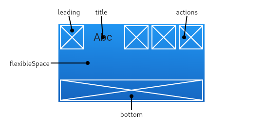
The AppBar displays the toolbar widgets, leading, title, and actions, above the bottom (if any). The bottom is usually used for a TabBar. If a flexibleSpace widget is specified then it is stacked behind the toolbar and the bottom widget. The following diagram shows where each of these slots appears in the toolbar when the writing language is left-to-right (e.g. English):
If the leading widget is omitted, but the AppBar is in a Scaffold with a Drawer, then a button will be inserted to open the drawer. Otherwise, if the nearest Navigator has any previous routes, a BackButton is inserted instead. This behavior can be turned off by setting the automaticallyImplyLeading to false. In that case a null leading widget will result in the middle/title widget stretching to start.
If the actions widget list is omitted or empty, but the AppBar is in a Scaffold with an end Drawer, then a button will be inserted to open the end drawer. This behavior can be turned off by setting the automaticallyImplyActions to false.
The AppBar insets its content based on the ambient MediaQuery's padding, to avoid system UI intrusions. It's taken care of by Scaffold when used in the Scaffold.appBar property. When animating an AppBar, unexpected MediaQuery changes (as is common in Hero animations) may cause the content to suddenly jump. Wrap the AppBar in a MediaQuery widget, and adjust its padding such that the animation is smooth.
To create a local project with this code sample, run:
flutter create --sample=material.AppBar.1 mysample
Material Design 3 introduced new types of app bar.
To create a local project with this code sample, run:
flutter create --sample=material.AppBar.2 mysample
Troubleshooting
Why don't my TextButton actions appear?
If the app bar's actions contains TextButtons, they will not be visible if their foreground (text) color is the same as the app bar's background color.
In Material v2 (i.e., when ThemeData.useMaterial3 is false), the default app bar backgroundColor is the overall theme's ColorScheme.primary if the overall theme's brightness is Brightness.light. Unfortunately this is the same as the default ButtonStyle.foregroundColor for TextButton for light themes. In this case a preferable text button foreground color is ColorScheme.onPrimary, a color that contrasts nicely with ColorScheme.primary. To remedy the problem, override TextButton.style:
To create a local project with this code sample, run:
flutter create --sample=material.AppBar.3 mysample
To create a local project with this code sample, run:
flutter create --sample=material.AppBar.4 mysample
See also:
- Scaffold, which displays the AppBar in its Scaffold.appBar slot.
- SliverAppBar, which uses AppBar to provide a flexible app bar that can be used in a CustomScrollView.
- TabBar, which is typically placed in the bottom slot of the AppBar if the screen has multiple pages arranged in tabs.
- IconButton, which is used with actions to show buttons on the app bar.
- PopupMenuButton, to show a popup menu on the app bar, via actions.
- FlexibleSpaceBar, which is used with flexibleSpace when the app bar can expand and collapse.
- material.io/design/components/app-bars-top.html
- m3.material.io/components/top-app-bar
- Cookbook: Place a floating app bar above a list
- Inheritance
- Implemented types
Constructors
-
AppBar({Key? key, Widget? leading, bool automaticallyImplyLeading = true, Widget? title, List<
Widget> ? actions, bool automaticallyImplyActions = true, Widget? flexibleSpace, PreferredSizeWidget? bottom, double? elevation, double? scrolledUnderElevation, ScrollNotificationPredicate notificationPredicate = defaultScrollNotificationPredicate, Color? shadowColor, Color? surfaceTintColor, ShapeBorder? shape, Color? backgroundColor, Color? foregroundColor, IconThemeData? iconTheme, IconThemeData? actionsIconTheme, bool primary = true, bool? centerTitle, bool excludeHeaderSemantics = false, double? titleSpacing, double toolbarOpacity = 1.0, double bottomOpacity = 1.0, double? toolbarHeight, double? leadingWidth, TextStyle? toolbarTextStyle, TextStyle? titleTextStyle, SystemUiOverlayStyle? systemOverlayStyle, bool forceMaterialTransparency = false, bool useDefaultSemanticsOrder = true, Clip? clipBehavior, EdgeInsetsGeometry? actionsPadding, bool animateColor = false}) - Creates a Material Design app bar.
Properties
-
actions
→ List<
Widget> ? -
A list of Widgets to display in a row after the title widget.
final
- actionsIconTheme → IconThemeData?
-
The color, opacity, and size to use for the icons that appear in the app
bar's actions.
final
- actionsPadding → EdgeInsetsGeometry?
-
The padding between the actions and the end of the AppBar.
final
- animateColor → bool
-
Whether the color should be animated.
final
- automaticallyImplyActions → bool
-
Controls whether we should try to imply the actions widget if null.
final
- automaticallyImplyLeading → bool
-
Controls whether we should try to imply the leading widget if null.
final
- backgroundColor → Color?
-
The fill color to use for an app bar's Material.
final
- bottom → PreferredSizeWidget?
-
This widget appears across the bottom of the app bar.
final
- bottomOpacity → double
-
How opaque the bottom part of the app bar is.
final
- centerTitle → bool?
-
Whether the title should be centered.
final
- clipBehavior → Clip?
-
The content will be clipped (or not) according to this option.
final
- elevation → double?
-
The z-coordinate at which to place this app bar relative to its parent.
final
- excludeHeaderSemantics → bool
-
Whether the title should be wrapped with header Semantics.
final
- flexibleSpace → Widget?
-
This widget is stacked behind the toolbar and the tab bar. Its height will
be the same as the app bar's overall height.
final
- forceMaterialTransparency → bool
-
Forces the AppBar's Material widget type to be MaterialType.transparency
(instead of Material's default type).
final
- foregroundColor → Color?
-
The default color for Text and Icons within the app bar.
final
- hashCode → int
-
The hash code for this object.
no setterinherited
- iconTheme → IconThemeData?
-
The color, opacity, and size to use for toolbar icons.
final
- key → Key?
-
Controls how one widget replaces another widget in the tree.
finalinherited
- leading → Widget?
-
A widget to display before the toolbar's title.
final
- leadingWidth → double?
-
Defines the width of AppBar.leading widget.
final
- notificationPredicate → ScrollNotificationPredicate
-
A check that specifies which child's ScrollNotifications should be
listened to.
final
- preferredSize → Size
-
A size whose height is the sum of toolbarHeight and the bottom widget's
preferred height.
final
- primary → bool
-
Whether this app bar is being displayed at the top of the screen.
final
- runtimeType → Type
-
A representation of the runtime type of the object.
no setterinherited
- scrolledUnderElevation → double?
-
The elevation that will be used if this app bar has something
scrolled underneath it.
final
- shadowColor → Color?
-
The color of the shadow below the app bar.
final
- shape → ShapeBorder?
-
The shape of the app bar's Material as well as its shadow.
final
- surfaceTintColor → Color?
-
The color of the surface tint overlay applied to the app bar's
background color to indicate elevation.
final
- systemOverlayStyle → SystemUiOverlayStyle?
-
Specifies the style to use for the system overlays (e.g. the status bar on
Android or iOS, the system navigation bar on Android).
final
- title → Widget?
-
The primary widget displayed in the app bar.
final
- titleSpacing → double?
-
The spacing around title content on the horizontal axis. This spacing is
applied even if there is no leading content or actions. If you want
title to take all the space available, set this value to 0.0.
final
- titleTextStyle → TextStyle?
-
The default text style for the AppBar's title widget.
final
- toolbarHeight → double?
-
Defines the height of the toolbar component of an AppBar.
final
- toolbarOpacity → double
-
How opaque the toolbar part of the app bar is.
final
- toolbarTextStyle → TextStyle?
-
The default text style for the AppBar's leading, and
actions widgets, but not its title.
final
- useDefaultSemanticsOrder → bool
-
Whether to use the default semantic ordering for the app bar's children for
accessibility traversal order.
final
Methods
-
createElement(
) → StatefulElement -
Creates a StatefulElement to manage this widget's location in the tree.
inherited
-
createState(
) → State< AppBar> -
Creates the mutable state for this widget at a given location in the tree.
override
-
debugDescribeChildren(
) → List< DiagnosticsNode> -
Returns a list of DiagnosticsNode objects describing this node's
children.
inherited
-
debugFillProperties(
DiagnosticPropertiesBuilder properties) → void -
Add additional properties associated with the node.
inherited
-
noSuchMethod(
Invocation invocation) → dynamic -
Invoked when a nonexistent method or property is accessed.
inherited
-
toDiagnosticsNode(
{String? name, DiagnosticsTreeStyle? style}) → DiagnosticsNode -
Returns a debug representation of the object that is used by debugging
tools and by DiagnosticsNode.toStringDeep.
inherited
-
toString(
{DiagnosticLevel minLevel = DiagnosticLevel.info}) → String -
A string representation of this object.
inherited
-
toStringDeep(
{String prefixLineOne = '', String? prefixOtherLines, DiagnosticLevel minLevel = DiagnosticLevel.debug, int wrapWidth = 65}) → String -
Returns a string representation of this node and its descendants.
inherited
-
toStringShallow(
{String joiner = ', ', DiagnosticLevel minLevel = DiagnosticLevel.debug}) → String -
Returns a one-line detailed description of the object.
inherited
-
toStringShort(
) → String -
A short, textual description of this widget.
inherited
Operators
-
operator ==(
Object other) → bool -
The equality operator.
inherited
Static Methods
-
preferredHeightFor(
BuildContext context, Size preferredSize) → double -
Used by Scaffold to compute its AppBar's overall height. The returned value is
the same
preferredSize.heightunless AppBar.toolbarHeight was null andAppBarTheme.of(context).toolbarHeightis non-null. In that case the return value is the sum of the theme's toolbar height and the height of the app bar's AppBar.bottom widget.