InputDecoration class
The border, labels, icons, and styles used to decorate a Material Design text field.
The TextField and InputDecorator classes use InputDecoration objects to describe their decoration. (In fact, this class is merely the configuration of an InputDecorator, which does all the heavy lifting.)
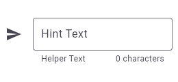
TextField using an InputDecorator. The
TextField displays a "send message" icon to the left of the input area,
which is surrounded by a border an all sides. It displays the hintText
inside the input area to help the user understand what input is required. It
displays the helperText and counterText below the input area.
To create a local project with this code sample, run:
flutter create --sample=material.InputDecoration.1 mysample
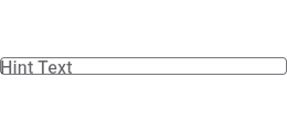
TextField using an
InputDecorator. The collapsed TextField surrounds the hint text and
input area with a border, but does not add padding around them.
To create a local project with this code sample, run:
flutter create --sample=material.InputDecoration.2 mysample
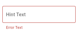
TextField with hint text, a red border
on all sides, and an error message. To display a red border and error
message, provide errorText to the InputDecoration constructor.
To create a local project with this code sample, run:
flutter create --sample=material.InputDecoration.3 mysample
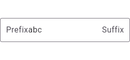
TextField with a round border and
additional text before and after the input area. It displays "Prefix" before
the input area, and "Suffix" after the input area.
To create a local project with this code sample, run:
flutter create --sample=material.InputDecoration.4 mysample
TextField with a prefixIcon that changes color
based on the WidgetState. The color defaults to gray and is green while focused.
To create a local project with this code sample, run:
flutter create --sample=material.InputDecoration.5 mysample
TextField with a prefixIcon that changes color
based on the WidgetState through the use of ThemeData. The color defaults
to gray, be blue while focused and red if in an error state.
To create a local project with this code sample, run:
flutter create --sample=material.InputDecoration.6 mysample
See also:
- TextField, which is a text input widget that uses an InputDecoration.
- InputDecorator, which is a widget that draws an InputDecoration around an input child widget.
- Decoration and DecoratedBox, for drawing borders and backgrounds around a child widget.
- Annotations
Constructors
- InputDecoration({Widget? icon, Color? iconColor, Widget? label, String? labelText, TextStyle? labelStyle, TextStyle? floatingLabelStyle, Widget? helper, String? helperText, TextStyle? helperStyle, int? helperMaxLines, String? hintText, Widget? hint, TextStyle? hintStyle, TextDirection? hintTextDirection, int? hintMaxLines, Duration? hintFadeDuration, @Deprecated('Use maintainHintSize instead. ' 'This will maintain both hint height and hint width. ' 'This feature was deprecated after v3.28.0-2.0.pre.') bool maintainHintHeight = true, bool maintainHintSize = true, bool maintainLabelSize = false, Widget? error, String? errorText, TextStyle? errorStyle, int? errorMaxLines, FloatingLabelBehavior? floatingLabelBehavior, FloatingLabelAlignment? floatingLabelAlignment, bool? isCollapsed, bool? isDense, EdgeInsetsGeometry? contentPadding, Widget? prefixIcon, BoxConstraints? prefixIconConstraints, Widget? prefix, String? prefixText, TextStyle? prefixStyle, Color? prefixIconColor, Widget? suffixIcon, Widget? suffix, String? suffixText, TextStyle? suffixStyle, Color? suffixIconColor, BoxConstraints? suffixIconConstraints, Widget? counter, String? counterText, TextStyle? counterStyle, bool? filled, Color? fillColor, Color? focusColor, Color? hoverColor, InputBorder? errorBorder, InputBorder? focusedBorder, InputBorder? focusedErrorBorder, InputBorder? disabledBorder, InputBorder? enabledBorder, InputBorder? border, bool enabled = true, String? semanticCounterText, bool? alignLabelWithHint, BoxConstraints? constraints, VisualDensity? visualDensity})
-
Creates a bundle of the border, labels, icons, and styles used to
decorate a Material Design text field.
const
- InputDecoration.collapsed({required String? hintText, @Deprecated('Invalid parameter because a collapsed decoration has no label. ' 'This feature was deprecated after v3.24.0-0.1.pre.') FloatingLabelBehavior? floatingLabelBehavior, @Deprecated('Invalid parameter because a collapsed decoration has no label. ' 'This feature was deprecated after v3.24.0-0.1.pre.') FloatingLabelAlignment? floatingLabelAlignment, TextStyle? hintStyle, Widget? hint, TextDirection? hintTextDirection, int? hintMaxLines, Duration? hintFadeDuration, @Deprecated('Use maintainHintSize instead. ' 'This will maintain both hint height and hint width. ' 'This feature was deprecated after v3.28.0-2.0.pre.') bool maintainHintHeight = true, bool maintainHintSize = true, bool maintainLabelSize = false, bool? filled = false, Color? fillColor, Color? focusColor, Color? hoverColor, InputBorder? border = InputBorder.none, bool enabled = true, BoxConstraints? constraints})
-
Defines an InputDecorator that is the same size as the input field.
const
Properties
- alignLabelWithHint → bool?
-
Typically set to true when the InputDecorator contains a multiline
TextField (TextField.maxLines is null or > 1) to override the default
behavior of aligning the label with the center of the TextField.
final
- border → InputBorder?
-
The shape of the border to draw around the decoration's container.
final
- constraints → BoxConstraints?
-
Defines minimum and maximum sizes for the InputDecorator.
final
- contentPadding → EdgeInsetsGeometry?
-
The padding for the input decoration's container.
final
- counter → Widget?
-
Optional custom counter widget to go in the place otherwise occupied by
counterText. If this property is non null, then counterText is
ignored.
final
- counterStyle → TextStyle?
-
The style to use for the counterText.
final
- counterText → String?
-
Optional text to place below the line as a character count.
final
- disabledBorder → InputBorder?
-
The border to display when the InputDecorator is disabled and is not
showing an error.
final
- enabled → bool
-
If false the opacity of the visual elements is reduced, including helperText,errorText, and counterText.
final
- enabledBorder → InputBorder?
-
The border to display when the InputDecorator is enabled and is not
showing an error.
final
- error → Widget?
-
Optional widget that appears below the InputDecorator.child and the border.
final
- errorBorder → InputBorder?
-
The border to display when the InputDecorator does not have the focus and
is showing an error.
final
- errorMaxLines → int?
-
The maximum number of lines the errorText can occupy.
final
- errorStyle → TextStyle?
-
The style to use for the InputDecoration.errorText.
final
- errorText → String?
-
Text that appears below the InputDecorator.child and the border.
final
- fillColor → Color?
-
The base fill color of the decoration's container color.
final
- filled → bool?
-
If true the decoration's container is filled with fillColor.
final
- floatingLabelAlignment → FloatingLabelAlignment?
-
Defines where the floating label should be displayed.
final
- floatingLabelBehavior → FloatingLabelBehavior?
-
Defines how the floating label should behave.
final
- floatingLabelStyle → TextStyle?
-
The style to use for InputDecoration.labelText when the label is
above (i.e., vertically adjacent to) the input field.
final
- focusColor → Color?
-
The fill color of the decoration's container when it has the input focus.
final
- focusedBorder → InputBorder?
-
The border to display when the InputDecorator has the focus and is not
showing an error.
final
- focusedErrorBorder → InputBorder?
-
The border to display when the InputDecorator has the focus and is
showing an error.
final
- hashCode → int
-
The hash code for this object.
no setteroverride
- helper → Widget?
-
Optional widget that appears below the InputDecorator.child.
final
- helperMaxLines → int?
-
The maximum number of lines the helperText can occupy.
final
- helperStyle → TextStyle?
-
The style to use for the helperText.
final
- helperText → String?
-
Text that provides context about the InputDecorator.child's value, such
as how the value will be used.
final
- hint → Widget?
-
The widget to use in place of the hintText.
final
- hintFadeDuration → Duration?
-
The duration of the hintText fade in and fade out animations.
final
- hintMaxLines → int?
-
The maximum number of lines the hintText can occupy.
final
- hintStyle → TextStyle?
-
The style to use for the hintText.
final
- hintText → String?
-
Text that suggests what sort of input the field accepts.
final
- hintTextDirection → TextDirection?
-
The direction to use for the hintText.
final
- hoverColor → Color?
-
The color of the highlight for the decoration shown if the container
is being hovered over by a mouse.
final
- icon → Widget?
-
An icon to show before the input field and outside of the decoration's
container.
final
- iconColor → Color?
-
The color of the icon.
final
- isCollapsed → bool?
-
Whether the decoration is the same size as the input field.
final
- isDense → bool?
-
Whether the InputDecorator.child is part of a dense form (i.e., uses less vertical
space).
final
- label → Widget?
-
Optional widget that describes the input field.
final
- labelStyle → TextStyle?
-
The style to use for InputDecoration.labelText when the label is on top
of the input field.
final
- labelText → String?
-
Optional text that describes the input field.
final
- maintainHintHeight → bool
-
Whether the input field's height should always be greater than or equal to
the height of the hintText, even if the hintText is not visible.
final
- maintainHintSize → bool
-
Whether the input field's size should always be greater than or equal to
the size of the hint or hintText, even if the hint or hintText are not visible.
final
- maintainLabelSize → bool
-
Whether the input field's size should always be greater than or equal to
the size of the label or labelText, even if the label or labelText are not visible.
final
- prefix → Widget?
-
Optional widget to place on the line before the input.
final
- prefixIcon → Widget?
-
An icon that appears before the prefix or prefixText and before
the editable part of the text field, within the decoration's container.
final
- prefixIconColor → Color?
-
Optional color of the prefixIcon
final
- prefixIconConstraints → BoxConstraints?
-
The constraints for the prefix icon.
final
- prefixStyle → TextStyle?
-
The style to use for the prefixText.
final
- prefixText → String?
-
Optional text prefix to place on the line before the input.
final
- runtimeType → Type
-
A representation of the runtime type of the object.
no setterinherited
- semanticCounterText → String?
-
A semantic label for the counterText.
final
- suffix → Widget?
-
Optional widget to place on the line after the input.
final
- suffixIcon → Widget?
-
An icon that appears after the editable part of the text field and
after the suffix or suffixText, within the decoration's container.
final
- suffixIconColor → Color?
-
Optional color of the suffixIcon.
final
- suffixIconConstraints → BoxConstraints?
-
The constraints for the suffix icon.
final
- suffixStyle → TextStyle?
-
The style to use for the suffixText.
final
- suffixText → String?
-
Optional text suffix to place on the line after the input.
final
- visualDensity → VisualDensity?
-
Defines how compact the decoration's layout will be.
final
Methods
-
applyDefaults(
Object inputDecorationTheme) → InputDecoration -
Used by widgets like TextField and InputDecorator to create a new
InputDecoration with default values taken from the
inputDecorationTheme. -
copyWith(
{Widget? icon, Color? iconColor, Widget? label, String? labelText, TextStyle? labelStyle, TextStyle? floatingLabelStyle, Widget? helper, String? helperText, TextStyle? helperStyle, int? helperMaxLines, String? hintText, Widget? hint, TextStyle? hintStyle, TextDirection? hintTextDirection, Duration? hintFadeDuration, int? hintMaxLines, bool? maintainHintHeight, bool? maintainHintSize, bool? maintainLabelSize, Widget? error, String? errorText, TextStyle? errorStyle, int? errorMaxLines, FloatingLabelBehavior? floatingLabelBehavior, FloatingLabelAlignment? floatingLabelAlignment, bool? isCollapsed, bool? isDense, EdgeInsetsGeometry? contentPadding, Widget? prefixIcon, Widget? prefix, String? prefixText, BoxConstraints? prefixIconConstraints, TextStyle? prefixStyle, Color? prefixIconColor, Widget? suffixIcon, Widget? suffix, String? suffixText, TextStyle? suffixStyle, Color? suffixIconColor, BoxConstraints? suffixIconConstraints, Widget? counter, String? counterText, TextStyle? counterStyle, bool? filled, Color? fillColor, Color? focusColor, Color? hoverColor, InputBorder? errorBorder, InputBorder? focusedBorder, InputBorder? focusedErrorBorder, InputBorder? disabledBorder, InputBorder? enabledBorder, InputBorder? border, bool? enabled, String? semanticCounterText, bool? alignLabelWithHint, BoxConstraints? constraints, VisualDensity? visualDensity, SemanticsService? semanticsService}) → InputDecoration - Creates a copy of this input decoration with the given fields replaced by the new values.
-
noSuchMethod(
Invocation invocation) → dynamic -
Invoked when a nonexistent method or property is accessed.
inherited
-
toString(
) → String -
A string representation of this object.
override
Operators
-
operator ==(
Object other) → bool -
The equality operator.
override