RoundRangeSliderTickMarkShape class
The default shape of each RangeSlider tick mark.
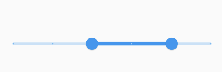
Tick marks are only displayed if the slider is discrete, which can be done by setting the RangeSlider.divisions to an integer value.
It paints a solid circle, centered on the track. The color is determined by the Slider's enabled state and track's active states. These colors are defined in: SliderThemeData.activeTrackColor, SliderThemeData.inactiveTrackColor, SliderThemeData.disabledActiveTrackColor, SliderThemeData.disabledInactiveTrackColor.
See also:
- RangeSlider, which includes tick marks defined by this shape.
- SliderTheme, which can be used to configure the tick mark shape of all sliders in a widget subtree.
- Inheritance
-
- Object
- RangeSliderTickMarkShape
- RoundRangeSliderTickMarkShape
Constructors
- RoundRangeSliderTickMarkShape({double? tickMarkRadius})
-
Create a range slider tick mark that draws a circle.
const
Properties
- hashCode → int
-
The hash code for this object.
no setterinherited
- runtimeType → Type
-
A representation of the runtime type of the object.
no setterinherited
- tickMarkRadius → double?
-
The preferred radius of the round tick mark.
final
Methods
-
getPreferredSize(
{required SliderThemeData sliderTheme, bool isEnabled = false}) → Size -
Returns the preferred size of the shape.
override
-
noSuchMethod(
Invocation invocation) → dynamic -
Invoked when a nonexistent method or property is accessed.
inherited
-
paint(
PaintingContext context, Offset center, {required RenderBox parentBox, required SliderThemeData sliderTheme, required Animation< double> enableAnimation, required Offset startThumbCenter, required Offset endThumbCenter, bool isEnabled = false, required TextDirection textDirection}) → void -
Paints the slider track.
override
-
toString(
) → String -
A string representation of this object.
inherited
Operators
-
operator ==(
Object other) → bool -
The equality operator.
inherited