SwitchListTile class
A ListTile with a Switch. In other words, a switch with a label.
The entire list tile is interactive: tapping anywhere in the tile toggles the switch. Tapping and dragging the Switch also triggers the onChanged callback.
To ensure that onChanged correctly triggers, the state passed into value must be properly managed. This is typically done by invoking State.setState in onChanged to toggle the state value.
The value, onChanged, activeThumbColor, activeThumbImage, and inactiveThumbImage properties of this widget are identical to the similarly-named properties on the Switch widget.
The title, subtitle, isThreeLine, and dense properties are like those of the same name on ListTile.
The selected property on this widget is similar to the ListTile.selected property. This tile's activeThumbColor is used for the selected item's text color, or the theme's SwitchThemeData.overlayColor if activeThumbColor is null.
This widget does not coordinate the selected state and the value; to have the list tile appear selected when the switch button is on, use the same value for both.
The switch is shown on the right by default in left-to-right languages (i.e. in the ListTile.trailing slot) which can be changed using controlAffinity. The secondary widget is placed in the ListTile.leading slot.
This widget requires a Material widget ancestor in the tree to paint itself on, which is typically provided by the app's Scaffold. The tileColor, and selectedTileColor are not painted by the SwitchListTile itself but by the Material widget ancestor. In this case, one can wrap a Material widget around the SwitchListTile, e.g.:
ColoredBox(
  color: Colors.green,
  child: Material(
    child: SwitchListTile(
      tileColor: Colors.red,
      title: const Text('SwitchListTile with red background'),
      value: true,
      onChanged:(bool? value) { },
    ),
  ),
)
Performance considerations when wrapping SwitchListTile with Material
Wrapping a large number of SwitchListTiles individually with Materials is expensive. Consider only wrapping the SwitchListTiles that require it or include a common Material ancestor where possible.
To show the SwitchListTile as disabled, pass null as the onChanged callback.
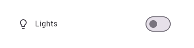
This widget shows a switch that, when toggled, changes the state of a bool
member field called _lights.
To create a local project with this code sample, run:
flutter create --sample=material.SwitchListTile.2 mysample
To create a local project with this code sample, run:
flutter create --sample=material.SwitchListTile.3 mysample
Semantics in SwitchListTile
Since the entirety of the SwitchListTile is interactive, it should represent itself as a single interactive entity.
To do so, a SwitchListTile widget wraps its children with a MergeSemantics widget. MergeSemantics will attempt to merge its descendant Semantics nodes into one node in the semantics tree. Therefore, SwitchListTile will throw an error if any of its children requires its own Semantics node.
For example, you cannot nest a RichText widget as a descendant of SwitchListTile. RichText has an embedded gesture recognizer that requires its own Semantics node, which directly conflicts with SwitchListTile's desire to merge all its descendants' semantic nodes into one. Therefore, it may be necessary to create a custom radio tile widget to accommodate similar use cases.
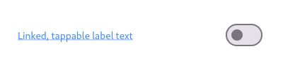
Here is an example of a custom labeled radio widget, called LinkedLabelRadio, that includes an interactive RichText widget that handles tap gestures.
To create a local project with this code sample, run:
flutter create --sample=material.SwitchListTile.4 mysample
SwitchListTile isn't exactly what I want
If the way SwitchListTile pads and positions its elements isn't quite what you're looking for, you can create custom labeled switch widgets by combining Switch with other widgets, such as Text, Padding and InkWell.
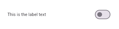
Here is an example of a custom LabeledSwitch widget, but you can easily make your own configurable widget.
To create a local project with this code sample, run:
flutter create --sample=material.SwitchListTile.5 mysample
See also:
- ListTileTheme, which can be used to affect the style of list tiles, including switch list tiles.
- CheckboxListTile, a similar widget for checkboxes.
- RadioListTile, a similar widget for radio buttons.
- ListTile and Switch, the widgets from which this widget is made.
- Inheritance
-
- Object
- DiagnosticableTree
- Widget
- StatelessWidget
- SwitchListTile
Constructors
-
SwitchListTile({Key? key, required bool value, required ValueChanged<
bool> ? onChanged, @Deprecated('Use activeThumbColor instead. ' 'This feature was deprecated after v3.31.0-2.0.pre.') Color? activeColor, Color? activeThumbColor, Color? activeTrackColor, Color? inactiveThumbColor, Color? inactiveTrackColor, ImageProvider<Object> ? activeThumbImage, ImageErrorListener? onActiveThumbImageError, ImageProvider<Object> ? inactiveThumbImage, ImageErrorListener? onInactiveThumbImageError, WidgetStateProperty<Color?> ? thumbColor, WidgetStateProperty<Color?> ? trackColor, WidgetStateProperty<Color?> ? trackOutlineColor, WidgetStateProperty<Icon?> ? thumbIcon, MaterialTapTargetSize? materialTapTargetSize, DragStartBehavior dragStartBehavior = DragStartBehavior.start, MouseCursor? mouseCursor, WidgetStateProperty<Color?> ? overlayColor, double? splashRadius, FocusNode? focusNode, WidgetStatesController? statesController, ValueChanged<bool> ? onFocusChange, bool autofocus = false, Color? tileColor, Widget? title, Widget? subtitle, bool? isThreeLine, bool? dense, EdgeInsetsGeometry? contentPadding, Widget? secondary, bool selected = false, ListTileControlAffinity? controlAffinity, ShapeBorder? shape, Color? selectedTileColor, VisualDensity? visualDensity, bool? enableFeedback, double? horizontalTitleGap, double? minVerticalPadding, double? minLeadingWidth, double? minTileHeight, Color? hoverColor, bool internalAddSemanticForOnTap = false}) -
Creates a combination of a list tile and a switch.
const
-
SwitchListTile.adaptive({Key? key, required bool value, required ValueChanged<
bool> ? onChanged, @Deprecated('Use activeThumbColor or activeTrackColor instead. ' 'This feature was deprecated after v3.31.0-2.0.pre.') Color? activeColor, Color? activeThumbColor, Color? activeTrackColor, Color? inactiveThumbColor, Color? inactiveTrackColor, ImageProvider<Object> ? activeThumbImage, ImageErrorListener? onActiveThumbImageError, ImageProvider<Object> ? inactiveThumbImage, ImageErrorListener? onInactiveThumbImageError, WidgetStateProperty<Color?> ? thumbColor, WidgetStateProperty<Color?> ? trackColor, WidgetStateProperty<Color?> ? trackOutlineColor, WidgetStateProperty<Icon?> ? thumbIcon, MaterialTapTargetSize? materialTapTargetSize, DragStartBehavior dragStartBehavior = DragStartBehavior.start, MouseCursor? mouseCursor, WidgetStateProperty<Color?> ? overlayColor, double? splashRadius, FocusNode? focusNode, WidgetStatesController? statesController, ValueChanged<bool> ? onFocusChange, bool autofocus = false, bool? applyCupertinoTheme, Color? tileColor, Widget? title, Widget? subtitle, bool? isThreeLine, bool? dense, EdgeInsetsGeometry? contentPadding, Widget? secondary, bool selected = false, ListTileControlAffinity? controlAffinity, ShapeBorder? shape, Color? selectedTileColor, VisualDensity? visualDensity, bool? enableFeedback, double? horizontalTitleGap, double? minVerticalPadding, double? minLeadingWidth, double? minTileHeight, Color? hoverColor, bool internalAddSemanticForOnTap = false}) -
Creates a Material ListTile with an adaptive Switch, following
Material design's
Cross-platform guidelines.
const
Properties
- activeColor → Color?
-
The color to use when this switch is on.
final
- activeThumbColor → Color?
-
The color to use when this switch is on.
final
-
activeThumbImage
→ ImageProvider<
Object> ? -
An image to use on the thumb of this switch when the switch is on.
final
- activeTrackColor → Color?
-
The color to use on the track when this switch is on.
final
- applyCupertinoTheme → bool?
-
Whether to apply the ambient CupertinoThemeData.
final
- autofocus → bool
-
True if this widget will be selected as the initial focus when no other
node in its scope is currently focused.
final
- contentPadding → EdgeInsetsGeometry?
-
The tile's internal padding.
final
- controlAffinity → ListTileControlAffinity?
-
Defines the position of control and secondary, relative to text.
final
- dense → bool?
-
Whether this list tile is part of a vertically dense list.
final
- dragStartBehavior → DragStartBehavior
-
Determines the way that drag start behavior is handled.
final
- enableFeedback → bool?
-
Whether detected gestures should provide acoustic and/or haptic feedback.
final
- focusNode → FocusNode?
-
An optional focus node to use as the focus node for this widget.
final
- hashCode → int
-
The hash code for this object.
no setterinherited
- horizontalTitleGap → double?
-
The horizontal gap between the titles and the leading/trailing widgets.
final
- hoverColor → Color?
-
The color for the tile's Material when a pointer is hovering over it.
final
- inactiveThumbColor → Color?
-
The color to use on the thumb when this switch is off.
final
-
inactiveThumbImage
→ ImageProvider<
Object> ? -
An image to use on the thumb of this switch when the switch is off.
final
- inactiveTrackColor → Color?
-
The color to use on the track when this switch is off.
final
- internalAddSemanticForOnTap → bool
-
Whether to add button:true to the semantics if onTap is provided.
This is a temporary flag to help changing the behavior of ListTile onTap semantics.
final
- isThreeLine → bool?
-
Whether this list tile is intended to display three lines of text.
final
- key → Key?
-
Controls how one widget replaces another widget in the tree.
finalinherited
- materialTapTargetSize → MaterialTapTargetSize?
-
Configures the minimum size of the tap target.
final
- minLeadingWidth → double?
-
The minimum width allocated for the ListTile.leading widget.
final
- minTileHeight → double?
-
The minimum height allocated for the ListTile widget.
final
- minVerticalPadding → double?
-
The minimum padding on the top and bottom of the title and subtitle widgets.
final
- mouseCursor → MouseCursor?
-
The cursor for a mouse pointer when it enters or is hovering over the
widget.
final
- onActiveThumbImageError → ImageErrorListener?
-
An optional error callback for errors emitted when loading
activeThumbImage.
final
-
onChanged
→ ValueChanged<
bool> ? -
Called when the user toggles the switch on or off.
final
-
onFocusChange
→ ValueChanged<
bool> ? -
Handler called when the focus changes.
final
- onInactiveThumbImageError → ImageErrorListener?
-
An optional error callback for errors emitted when loading
inactiveThumbImage.
final
-
overlayColor
→ WidgetStateProperty<
Color?> ? -
The color for the switch's Material.
final
- runtimeType → Type
-
A representation of the runtime type of the object.
no setterinherited
- secondary → Widget?
-
A widget to display on the opposite side of the tile from the switch.
final
- selected → bool
-
Whether to render icons and text in the activeThumbColor.
final
- selectedTileColor → Color?
-
If non-null, defines the background color when SwitchListTile.selected is true.
final
- shape → ShapeBorder?
-
Defines the tile's InkWell.customBorder and Ink.decoration shape.
final
- splashRadius → double?
-
The splash radius of the circular Material ink response.
final
- statesController → WidgetStatesController?
-
Controls the interactive states of the backing ListTile.
final
- subtitle → Widget?
-
Additional content displayed below the title.
final
-
thumbColor
→ WidgetStateProperty<
Color?> ? -
The color of this switch's thumb.
final
-
thumbIcon
→ WidgetStateProperty<
Icon?> ? -
The icon to use on the thumb of this switch
final
- tileColor → Color?
-
Defines the background color of
ListTilewhen selected is false.final - title → Widget?
-
The primary content of the list tile.
final
-
trackColor
→ WidgetStateProperty<
Color?> ? -
The color of this switch's track.
final
-
trackOutlineColor
→ WidgetStateProperty<
Color?> ? -
The outline color of this Switch's track.
final
- value → bool
-
Whether this switch is checked.
final
- visualDensity → VisualDensity?
-
Defines how compact the list tile's layout will be.
final
Methods
-
build(
BuildContext context) → Widget -
Describes the part of the user interface represented by this widget.
override
-
createElement(
) → StatelessElement -
Creates a StatelessElement to manage this widget's location in the tree.
inherited
-
debugDescribeChildren(
) → List< DiagnosticsNode> -
Returns a list of DiagnosticsNode objects describing this node's
children.
inherited
-
debugFillProperties(
DiagnosticPropertiesBuilder properties) → void -
Add additional properties associated with the node.
inherited
-
noSuchMethod(
Invocation invocation) → dynamic -
Invoked when a nonexistent method or property is accessed.
inherited
-
toDiagnosticsNode(
{String? name, DiagnosticsTreeStyle? style}) → DiagnosticsNode -
Returns a debug representation of the object that is used by debugging
tools and by DiagnosticsNode.toStringDeep.
inherited
-
toString(
{DiagnosticLevel minLevel = DiagnosticLevel.info}) → String -
A string representation of this object.
inherited
-
toStringDeep(
{String prefixLineOne = '', String? prefixOtherLines, DiagnosticLevel minLevel = DiagnosticLevel.debug, int wrapWidth = 65}) → String -
Returns a string representation of this node and its descendants.
inherited
-
toStringShallow(
{String joiner = ', ', DiagnosticLevel minLevel = DiagnosticLevel.debug}) → String -
Returns a one-line detailed description of the object.
inherited
-
toStringShort(
) → String -
A short, textual description of this widget.
inherited
Operators
-
operator ==(
Object other) → bool -
The equality operator.
inherited